As drivers, there’s a whole host of things we take for granted. Little everyday strokes of genius so ubiquitous that you barely even notice them… well, unless you’re as anally retentive as me, I suppose. Yes, join me for some old-school geekery as we look at three genius inventions that changed the way we drive without us even knowing it.
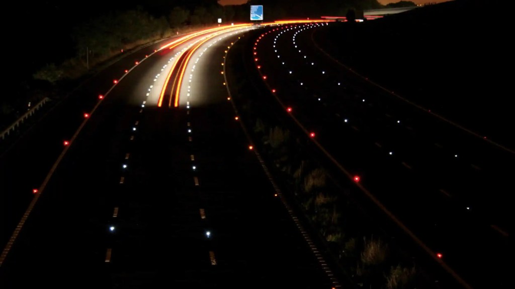
It’s 1934, and a Yorkshire lad called Percy Shaw is driving home from the pub (it was a different time) when he happens upon an idea. Now, this story has been told a few different ways over the last ninety years, so I’ll do my best to recall all the details. The more romanticised version is that he found himself driving in thick fog, nearly hitting a stone wall, only for the eyes of a cat perched on top of the wall to reflect the light from his headlights, saving his life. The perhaps more likely version, however, is that the village of Ambler Thorn where he lived had tram lines which had been taken up for repair, and on the night in question, Shaw realised how useful the reflective steel rails were for driving in low visibility. Both stories have been claimed as true over the years, so take your pick. Maybe the cat was driving the tram, I don’t know.
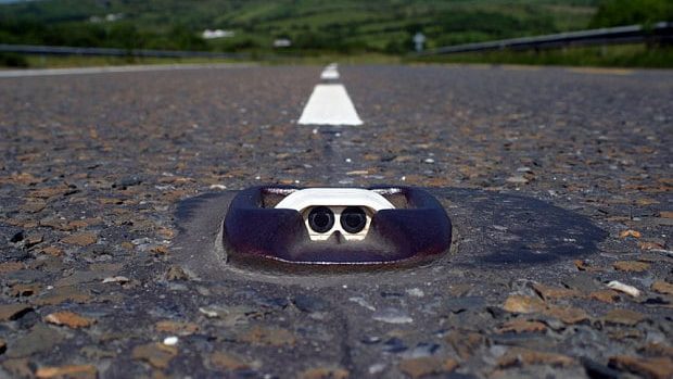
The long and short of it is that Percy Shaw used this as the impetus to design the first “Cat’s Eye” road stud, a reflective beacon used to denote the boundaries between lanes in low light, an invention that gained nationwide usage just a few years later when a certain Mr Hitler started flying Messerschmitts overhead and the powers that be were forced to turn off all of Britain’s streetlamps. “But Tom” I hear you cry, “A reflective surface? That hardly counts as genius”. To which I say; yeah, but have you really looked at one? The actual design of a Cat’s Eye is genuinely quite superb. Essentially, they’re made up of three parts. The outer cast iron housing sits recessed into the road, smoothed off on all sides to prevent any damage to tyres should you run over it, the middle section (in white in the above photo) is made of deformable rubber, with the reflective lenses mounted inside. Now the REALLY clever bit. Under the rubber section is a small reservoir that collects rainwater, so if you run over a Cat’s Eye, the deformable section pushes the lenses down into the water, and then as they come back up, the rubber is moulded to act as a wiper, making the whole device self-cleaning and meaning that they virtually never require maintenance. They even come in different colours depending on where they’re needed. On a motorway, red is the left-hand edge of the carriageway, orange is on the right-hand side, white is between lanes, and green shows you where slip roads are.
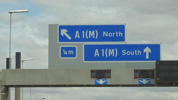
In 1957, panic struck the UK government. Our brand-new motorway network was wreaking havoc because, at the heady speeds of 60mph, Britain’s complicated, fiddly road signs were damn-near impossible to read. Enter; Jock Kinneir and Margaret Calvert, two graphic designers tasked with revolutionising Britain’s signage. Firstly, the standard black-text-on-white-background was scrapped in favour of an easier to read white-text-on-blue-background layout that made the letters more visible in low light, secondly, Kinneir and Calvert borrowed an idea from the Americans… and then did the exact opposite. At the time, American highway signs were printed in block capitals, with the idea being that this made the words STAND OUT when driving past at speed, in reality, it actually takes the brain marginally longer to process words written in all caps (which makes it handy for sending snotty emails to people you don’t like), and mixed-case lettering (with The Start Of Every Word Capitalised) is much quicker to read as your brain mostly just fills in the gaps for you.
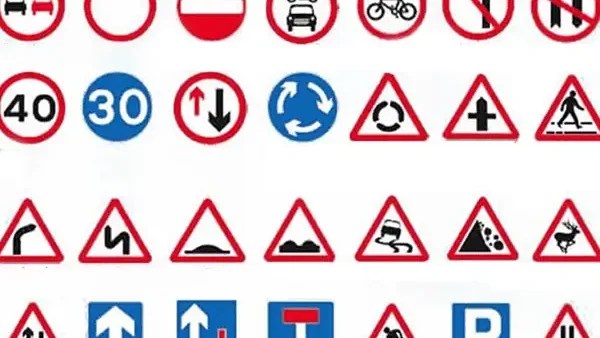
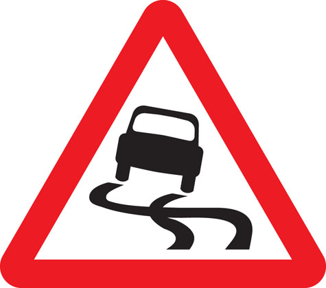
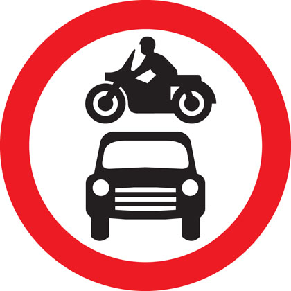
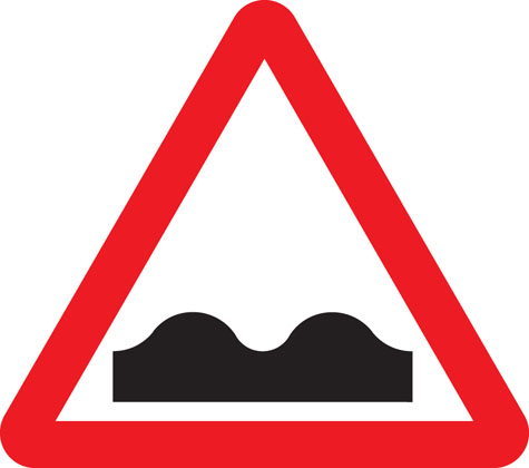
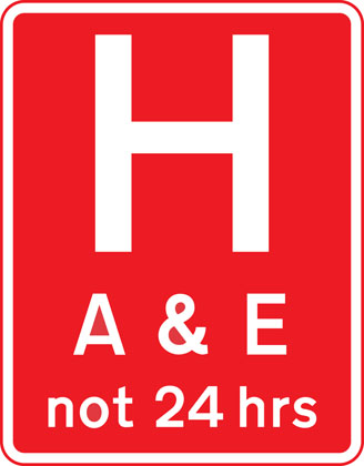
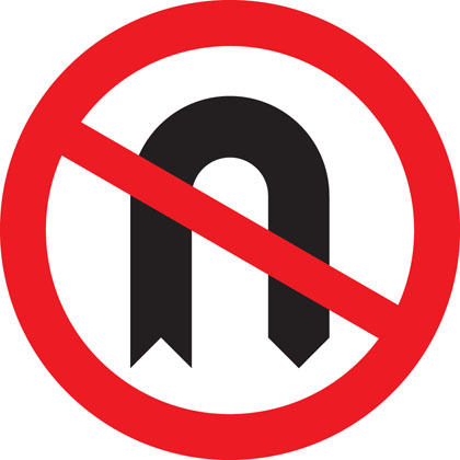
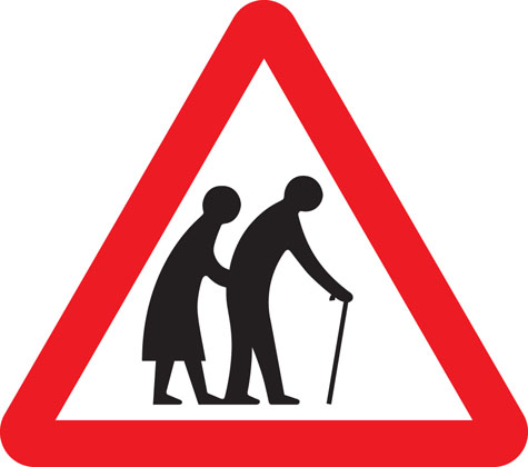
Impressed by their work on the motorways, Kinneir and Calvert were employed again in 1963 to redesign the rest of the UK’s road signs, simplifying and centralising the system, so instead of having different versions of signs up and down the country, everything was uniform and easily understandable. If it’s in a red triangle, it’s a warning of something coming up (Schools, construction, tight bends etc), If it’s in a red circle, it’s a change in regulation (speed limits, no left/right turn, no bicycles/motor vehicles), and if it’s a white circle with a black bar across it, it’s my particular favourite sign; “Go nuts” (for legal reasons, that’s a joke). The symbols used on the signs were designed to be quickly recognisable and difficult to confuse with each other. But that doesn’t mean they aren’t sometimes quite funny. Here’s a few highlights:
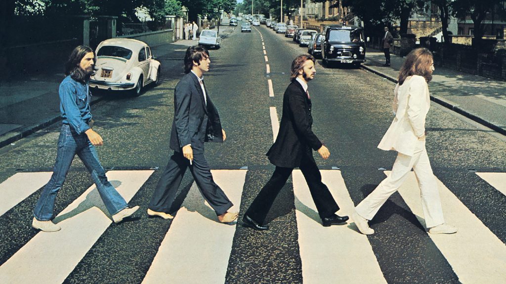
And finally, while we all love driving, some of us also enjoy not being run over, so let’s talk about crossings. In 1931, Minister of Transport Leslie Hore-Belisha wanted to improve pedestrian safety when crossing the road and decided that the best way to go about this was to create fixed crossing places with some sort of beacon to tell drivers where they were. Something like a black and white pole with a big flashy orange light on top perhaps. In 1935, the “Belisha Beacon” was rolled out nationwide, creating the first pedestrian crossing as we know them today. Improving visibility of the crossings for motorists, the beacons were joined in 1957 by painted white stripes on the road surface, giving us the first Zebra crossing. And if you’re wondering where the name comes from, that’s down to Cardiff MP James Callaghan who, on visiting the Transport Research Laboratory, pointed out that white stripes on a black road looked a bit like a Zebra.
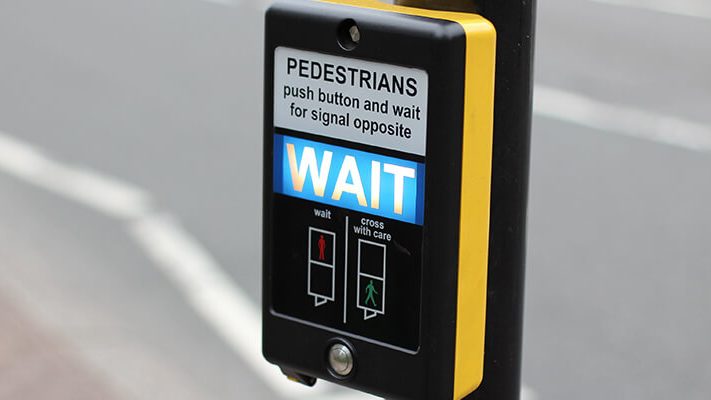
Fast forward to 1969, and the UK sees its first Pelican crossing. The name gives the game away here (Pelican is actually PELICON; PEdestrian LIght CONtrolled), a Pelican crossing is any one that features traffic lights with a control box, allowing pedestrians to request a red light to stop the traffic for a short time. When it’s safe to cross, the green man lights up and the crossing beeps to signal to visually impaired pedestrians. Sometimes, if crossing are too close together or near residential areas, they don’t beep, so to keep things safe for visually impaired people, every Pelican crossing control box features a small tactile cone on the bottom, that spins when it’s safe to cross. Yes, that’s the same little nubbin that, as kids, we were all convinced made the lights go faster if you spun it. Come on, admit it, we all did it. And one final crumb of useless knowledge, a wider Pelican crossing that allows for pedestrians and cyclists to cross in the same place is called a Toucan crossing, because “Two Can” cross.
All of these inventions are testament to the UK’s attitude to problem solving. If something needs doing, we’re guaranteed to find a simple and creative way to get it done, to the point where the solution becomes so beautifully implemented, that you barely even notice it in the first place.


Leave a Reply